Superconstruct
Platform Layout System
for Data-Heavy Workflows
Designing a scalable, structured interface for complex construction management workflows. The goal was not to solve a single feature — but to establish a layout system that makes dense, data-heavy screens usable, structured, and predictable.
Overview
A Unified Layout System for Complex Construction Platforms
This project focuses on designing a unified layout system for a construction management platform. Instead of solving a single feature, the goal was to establish a consistent page structure, clear data hierarchy, and scalable patterns across modules like Pay Applications, Contracts, and Documents.
The work addresses how complex, data-heavy screens can be made usable, structured, and predictable — ensuring that users can find actions, understand structure, and scan information without cognitive overload.
Container-Based Structure
All elements grouped into defined containers for better readability and separation of concerns.
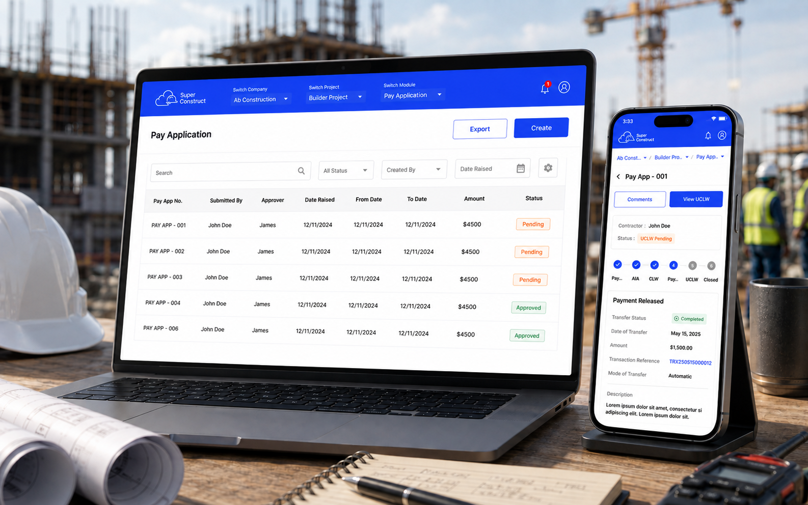
Table System Redesign
Header separation, contextual filters, and right-aligned controls for quick data access.
Action Hierarchy
Defined CTA system with primary, secondary, and disabled states with transparent feedback.
Navigation System
Separate navigation layer with consistent company, project, and module switching.
Context
The Environment We Were Designing For
Construction platforms operate with multiple modules (Pay Apps, Contracts, Documents, etc.), deep navigation layers (Company → Project → Module), dense tabular data, and multiple stakeholders interacting with the same system.
01
Multiple Modules
Pay Applications, Contracts, Documents, and more
02
Deep Navigation
Company → Project → Module layers
03
Dense Tabular Data
Financial figures, status tracking, metadata
04
Many Stakeholders
Contractors, project managers, finance teams
Problem Statement
The challenge wasn't features — it was structure
From the provided designs, it was clear that construction platforms suffer from structural breakdowns at every level. The interface lacked a coherent system for organizing information, placing actions, and guiding users through complex workflows.
Users were struggling not with what the platform could do, but with how to navigate and make sense of it all.
Filters, tables, and actions placed inconsistently
Fragmented LayoutEverything competes for attention
Weak HierarchyCompany / Project / Module switching feels disconnected
Navigation BreakdownCTAs appear in different positions across screens
Inconsistent ActionsUsers need to process too much at once
Cognitive OverloadGoal
What We Set Out to Achieve
01
Build a Layout System
Create reusable patterns for tables, filters, and actions — not just individual screens.
02
Establish Clear Hierarchy
Define primary vs secondary zones so users know where to look and what to do first.
03
Ensure Cross-Platform Consistency
Same layout logic across web and mobile without losing structure or branding.
04
Reduce Cognitive Load
Use structure and grouping so users can scan, understand, and act without mental fatigue.
05
Scalable for Future Modules
Design a system that works for existing modules and future features alike.
Key Insight
“In data-heavy platforms, layout clarity matters more than visual styling.”
Users don't struggle with features — they struggle with finding actions, understanding structure, and scanning information. The real design challenge was not making it beautiful, but making it scannable, predictable, and actionable.
Solution Approach
A Layered Layout System
The design introduces a layered layout system that creates a predictable mental model across all modules. Instead of free-floating elements, everything is organized into distinct, logical zones.
Global Navigation Layer
Company / Project / Module switching, persistent across platform
Page Control Layer
Page title, breadcrumb, and primary actions (Create, Export)
Data Interaction Layer
Search, filters, and sorting controls within table context
Data Display Layer
Tables and structured content with clear grouping and scanability
Layout System Breakdown
Six Core Design Decisions
Container-Based Structure
Instead of free-floating elements, everything is grouped into table containers, filter containers, and detail containers. This creates better readability, reduced clutter, and clear separation of concerns.
Better readability, reduced clutter, clear separation of concerns
Table System Redesign
Header is visually separated with color hints. Filters are placed inside the table context. Controls are right-aligned for quick access. Multiple header styles were explored: brand tint, grey with gradient, and flat grey.
System thinking, not just UI styling
Action Hierarchy
A clear CTA system: Primary actions use filled buttons, secondary use outline, and disabled states show feedback on click via snackbar instead of silently disabling buttons.
Transparency and user trust over silent disabling
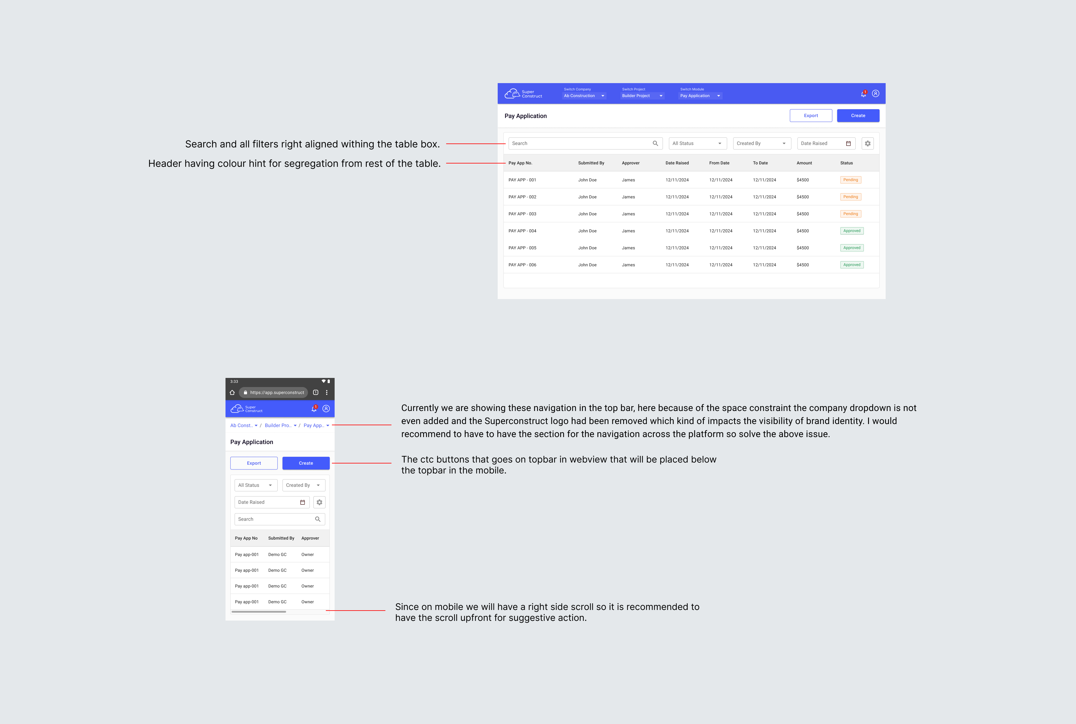
Navigation System
The topbar was overloaded and brand visibility was reduced on mobile. A separate navigation layer was introduced with consistent company, project, and module switching structure.
Aligns the entire platform, not just one page
Responsive Behavior
Mobile considerations included intentional horizontal scroll, CTAs repositioned below the topbar, and simplified navigation. This is adaptive design, not just responsive shrinking.
Adaptive design preserving structure and branding
Information Segmentation
In detail views, containers are used for clear grouping and separation of status, payment details, and metadata. This drastically improves scanability and reduces cognitive effort.
Drastically improves scanability in dense views
Design Principles
Guiding Rules of the System
01
Structure Over Decoration
Focus on clarity, not visual noise. Every element should serve a functional purpose.
02
Predictability
Same layout logic across all modules so users build mental models quickly.
03
Progressive Disclosure
Show only what's needed, when it's needed. Layer complexity rather than exposing it all at once.
04
Action Clarity
Users should always know what they can do and where to click. No ambiguity in CTA placement or state.
Before vs After
Transformation at a Glance
Impact
What Changed for Users
01
Faster Task Completion
Users spend less time searching for actions and navigating the interface.
02
Reduced Navigation Confusion
A unified navigation system eliminates the disorientation of switching between modules.
03
Improved Data Scanning
Structured containers and clear hierarchy make dense information scannable at a glance.
04
Scalable for Future Modules
New features can be added without breaking the existing layout system or user mental model.
What Makes This Strong
This is Not Just UI Design
Design System Thinking at Layout Level
This wasn't about making one screen look good — it was about creating rules that govern how every screen behaves.
Enterprise UX Problem Solving
Tackling real problems that affect daily productivity for construction professionals managing complex projects.
Scalable Architecture for Complex Platforms
The layout system is built to grow — new modules, new stakeholders, new data types can all fit within the existing framework.
Learnings
Key Takeaways
Layout is the foundation of usability in enterprise products — structure comes before styling.
Consistency reduces the learning curve across modules — users build trust through predictability.
Small interaction details (like button states and disabled feedback) matter a lot in daily workflows.
Designing systems is more impactful than designing individual screens — it scales value exponentially.
Open on desktop for the full experience